|
|
| I don't have a formal education in design, but I am interested in graphics in general. As I am not very good in drawing, especially drawing people, I always felt attracted by the more abstract approach and especially composition of "prefab" objects.
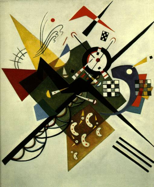
I remember that even as a child I was really interested in graphical composition. Browsing through my parents' encyclopedia modern painters always grabbed my attention more than the "old masters" and I always had to stop at the page with the Kandinskys and really study them to see whether I could find something in the paintings I hadn't seen before. My favourite Kandinsky back then definitely was "On White". Growing up in the sixties I have of course been exposed to a fair share of pop art, so I think that influenced my taste as well. I still feel attracted to posters or simple packaging from that period. The seventies on the other hand (... yikes) were a different era altogether. I didn't like the obvious seventies colour combinations back then and I find them awful still. Then starting in the eighties with the advancement of the first personal computers I regained my interest in graphics and for the first time became aware of what can be achieved by type setting. Especially, the early (still black & white) Macs had an enormous influence and I still remember the first time I had the option to format a document in either "Times Roman" or "Helvetica" and observe the difference in impression caused by the use of either a serif or non-serif font. In this section of my web site I'll give an overview of some of the other web sites I implemented as well as some of the record sleeves I designed. Especially, for the web sites I haven't gone back and improved them (to current taste of course) because I think it's interesting to see the development in those web sites. With development I do not mean a development only in these sites but a development of web sites on the Web in general. And yes I am sure that we all influence each other and so you might see things here you have seen somewhere else before. But then again an essentially good basic design deserves it to be "re-used". I'm rather "inspired" by somebody else's good design, than to invent the entire machinery including the wheel again myself. Therefore, I would like to finish this section with a quote from a "John Hiatt Rockumentary": "If it ain't nailed down, you gotta take it!" |
The Web Museum, Paris has a nice section on Wassily Kandinsky. As an introduction to typesetting I really like "Twentieth century type designers" by Sebastian Carter. |
